App design
AnemoCheck is an app that estimates your hemoglobin levels with just a photo of your fingernails. I played a major role in the design of the app. Starting from its earliest stages all the way to getting accepted in the app store, then making feature updates such as the paid "premium" option and implementing an "auto-nail detection" version of the test.
Bringing the brand identity to life.
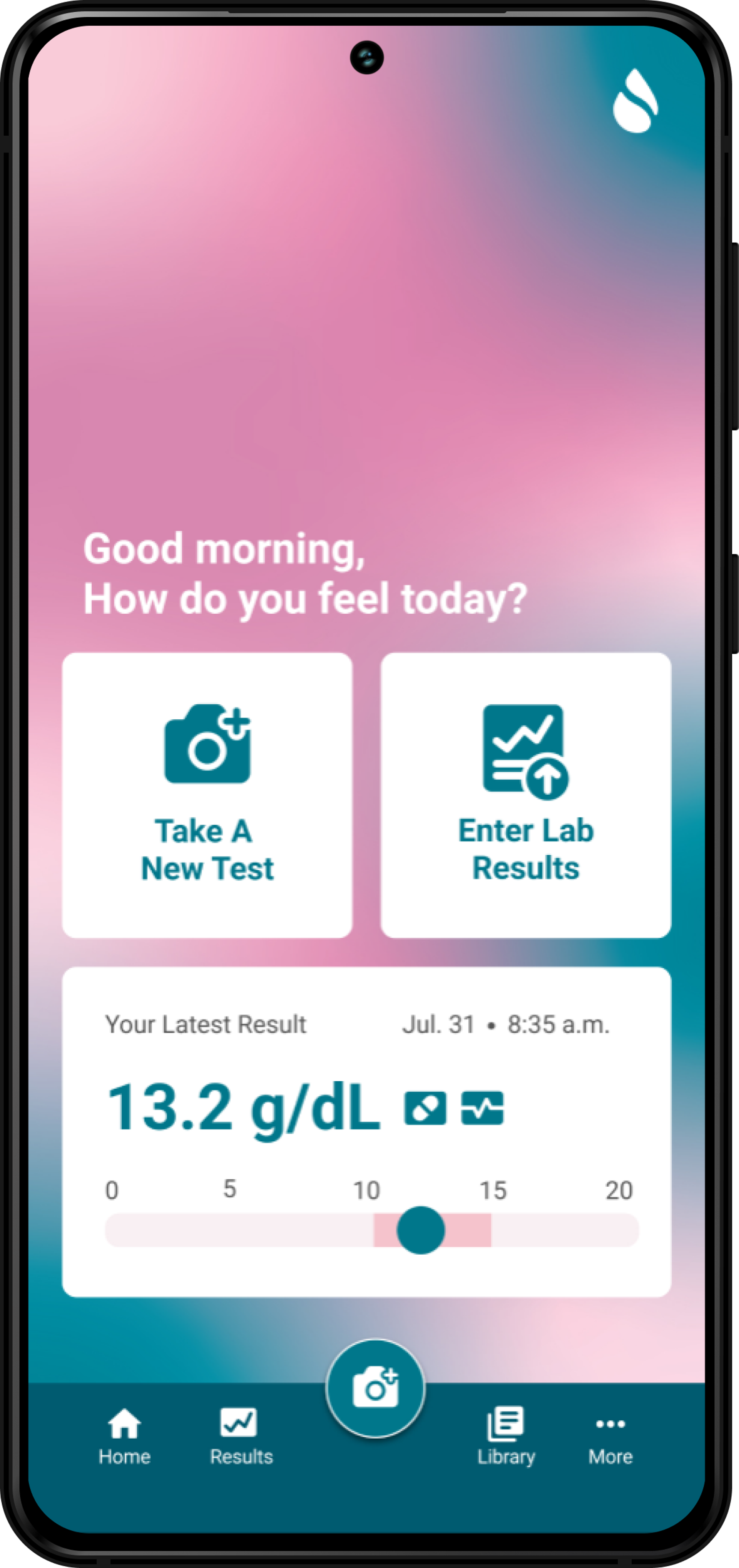
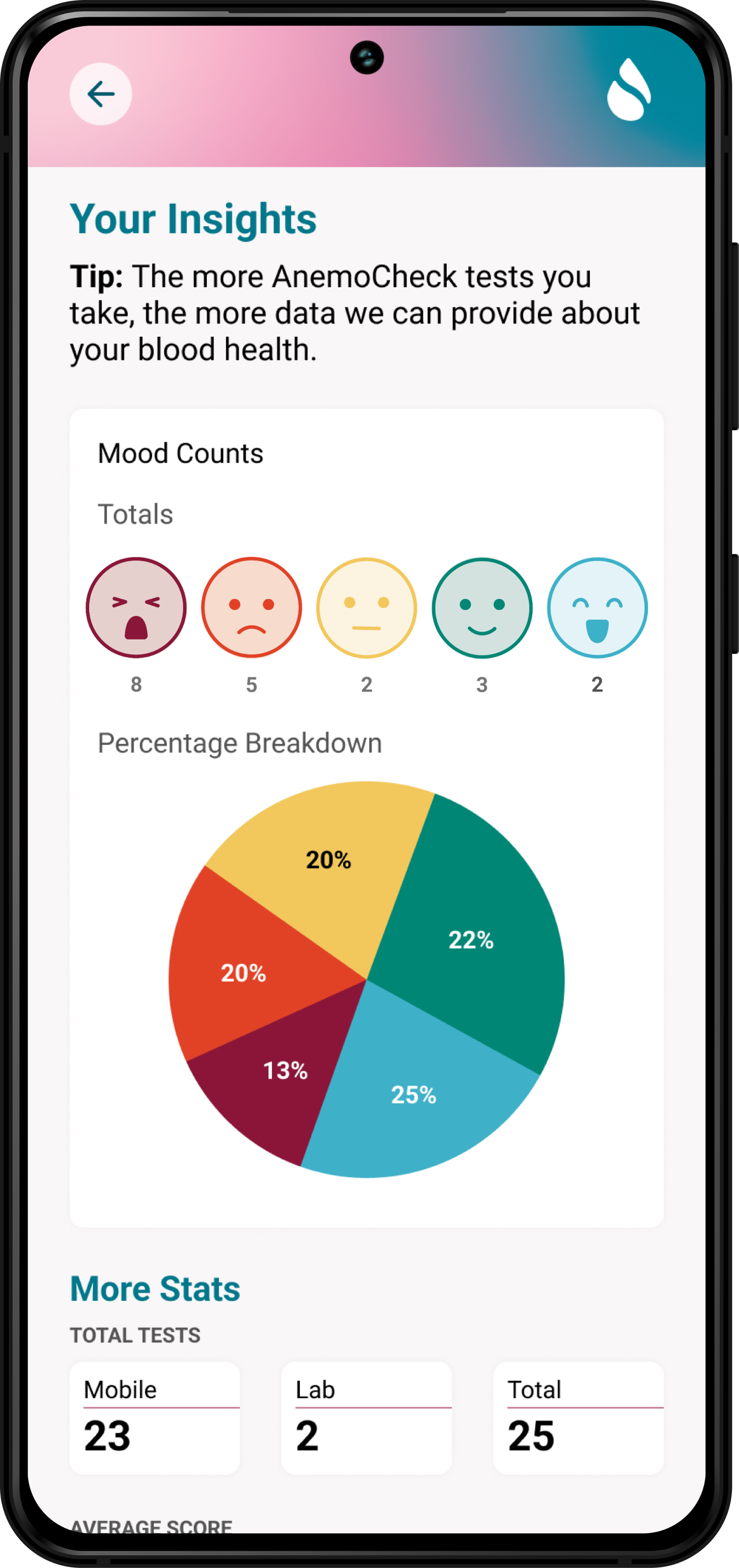
The app's vibrant teal and pink colors breathe life into the brand, while also presenting challenging color contrast and accessibility issues. The mixed gradient background not only adds a touch of uniqueness but also allows for more accessible tile designs, setting it apart from the typical sterile medical company aesthetic.
Elevating with premium features.
When tasked with enhancing the premium features to support a new "lab test calibration" feature, I embraced the challenge. By crafting custom animations and icons that fully embrace our brand's color palette, I elevated the user experience for our premium users, making every interaction an enticing and enjoyable one.

Simplifying the user experience.
Designing the automatic version of the test presented a unique challenge. My designs focused on user-centricity, resulting in a clean and straightforward design that offers clear and intuitive directions. Despite some of the team's preference for graphic-intensive nail identifiers, a thorough A/B test revealed that a more minimalist approach triumphed, ensuring an effortless and user-friendly experience.